
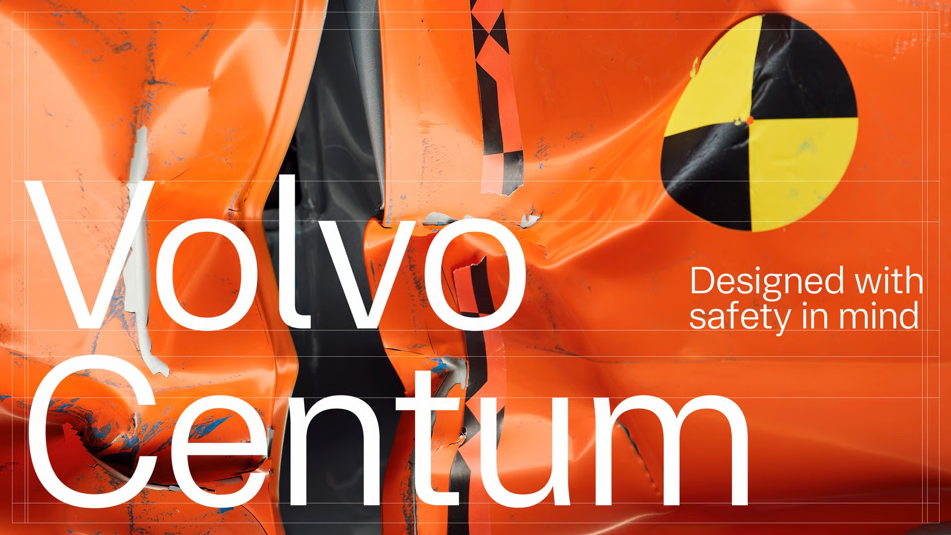
The name Volvo is almost instantly associated with automotive safety. The reason behind this historic relationship is due to developments like the one now unveiled: the Swedish brand announced the creation of a new font, Centum, presented as a typeface designed to reduce the level of driver distraction.
The company from Gothenburg claims to believe that “typography can also contribute to safer driving” and, therefore, decided to partner with a design studio, Dalton Magg, a world-renowned company in this field, to create Centum, which is set to debut in the recently presented EX60, and will later be integrated into the rest of Volvo’s offerings. The goal is to make reading information while driving much simpler, as the speed of action decreases the likelihood of distractions.
During the creative process, special attention was given to every curve of the letters, and to elements such as the spacing between characters, to reduce visual “noise” and the loss of users’ concentration. According to Volvo, it is an “exercise in Scandinavian design applied to reading in motion”.
The name Centum, in turn, is a direct reference to the centenary of the Nordic manufacturer, which will be celebrated in 2027. This font was developed to function fluidly and consistently across various platforms and driving conditions, supporting applications in over 800 languages, and optimized performance both in systems mounted on car dashboards and in other brand applications.
“Every detail of our interface represents an opportunity to support safer driving. Typography is a powerful, underestimated ‘tool’”, states Matthew Hall from Volvo. Zeynep Akay from Dalton Maag adds that “designing for reading on the move, and at first glance, requires a different creative approach than usual. This new typography was designed to work under pressure, in many languages and at 100 km/h!”.


